This is where I post my projects upon their completion. Click the project title to access the full project reports.
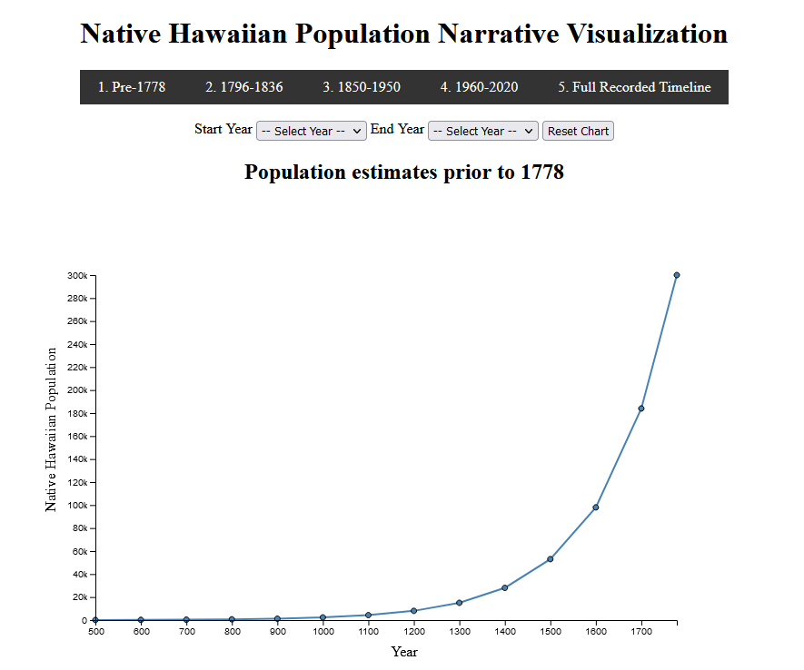
Native Hawaiian Population Narrative Visualization

Date: August 8th, 2023
Class: CS416 Deep Learning for Healthcare @ UIUC
Project Summary
Narrative Visualization showcasing the Native Hawaiian population in Hawaii over time. Created using Javascript and the D3 framework.
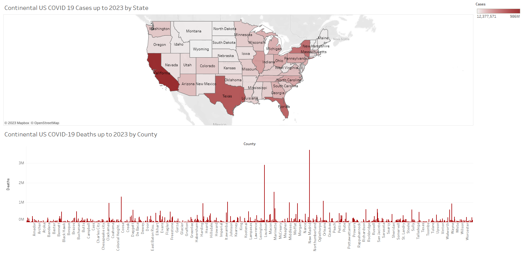
Continental US COVID 19 Cases Dashboard (up to 2023)

Date: July 8th, 2023
Class: CS416 Deep Learning for Healthcare @ UIUC
Project Summary
Tableau Dashboard showcasing COVID 19 cases by state and county.
TRACE for Cardiac Arrest Prediction

Date: May 8th, 2023
Class: CS598 Deep Learning for Healthcare @ UIUC
Project Summary
This repository is our attempt at reproducing the experiments in Learning Unsupervised Representations for ICU Timeseries.
Addison Weatherhead, Robert Greer, Michael-Alice Moga, Mjaye Mazwi, Danny Eytan, Anna Golden- berg, and Sana Tonekaboni. 2022. Learning Unsupervised Representations for ICU Timeseries. In Pro- ceedings of the Conference on Health, Inference, and Learning, volume 174 of Proceedings of Machine Learning Research, pages 152–168. PMLR.
Much of our code is sourced from TRACE Github Repo which is the original implementation of the experiments from this paper.
The link to the github repo is here.
Data Science Capstone - Park Visitation Covid Dashboard
Date: May 11th, 2021
Class: DS 440 (Capstone)
Instructor: Prasenjit Mitra (Penn State University, College of Information Sciences and Technology)
Project Summary
Overview
Parks are dedicated public spaces that provide valuable benefits to public health and well-being. Park managers and tourism researchers have much to gain by understanding the patterns behind visitations to parks. Better decisions about which parks to allocate resources to can be made, so being able to track park visitation has major policy implications. Visitation data is available from companies like Safegraph; the challenge then is to make the raw visitation data accessible, visual, and otherwise useful for non-technical users.
Objectives
Our client’s requirements and thus our team objectives were two-fold, though more emphasis was placed on the first point:
-
Create a dashboard that allows the user to easily select a park and see its visitation data with visuals and charts.
-
Analyze and draw insights from visitation data.
Approach
– Met weekly with our client Dr. Pan to get his feedback on our project and adjust direction if needed
– Conducted exploratory data analysis with initial sample data to familiarize ourselves
– Built a prototype dashboard to test visualizing park data using Python
– Worked out tentative user + design specifications for an actual website with our client
– Downloaded full visitation dataset from Safegraph
– Began development of the dashboard frontend using ReactJS
– Implemented the interactive map with multiple layers using Mapbox
– Implemented interactive charts using the amCharts Javascript library
– Tested PostgresQL as a backend, ultimately switched to MongoDB due to convenience
– Wrote an API to retrieve visitation data from MongoDB using ExpressJS
– Demoed our product to social scientists from the National Park Service and got their feedback
– Created map functionality to visualize visitor-origins for a park
– Deployed the dashboard application via Heroku
– Developed an ANCOVA model to analyze the impact COVID19 has had on vistations to National Parks, alongside the determinants of racial demographic, distance, urban classification and median income of the visitors census origin.
Outcomes
- Tourism researchers, park managers, and others interested in tracking park visitations now have a fully functional dashboard to do so (live now at park-visitation.herokuapp.com !)
- COVID19 has significantly impacted visitations to national parks, with racial demographics and distance from visitor census origin showing significance towards park visitations amidst COVID19.
Sentiment Comparison of Political Twitter/Parler Posts prior to the January 6th Insurrection at the Capitol

Date: May 10th, 2021
Class: DS 340W
Instructor: Kaamran Raahemifar (Penn State University, College of Information Sciences and Technology)
Abstract
The insurrection that took place on January 6th, 2021 is an event that will go down in history as a catastrophic failure by the U.S. government. Heads eventually turned towards Parler, a social media site similar to Twitter as a breeding ground for the extremists to plan their attack on the capitol. Our team compared sentiment scores for Parler and Twitter posts. Posts were gathered from Twitter and Parler prior to January 6th. Separate posts were gathered to train a binary classifier that labels posts as political or non-political. The political posts were then processed to calculate their sentiment scores, and the averages were compared. The average negative sentiment scores for Twitter was higher than Parler for TextBlob, but was lower than Parler for NLTKVader. Average sentiment scores for positive and neutral were relatively similar between TextBlob and NLTKVader. Results are inconclusive, with NLTK Vader and TextBlob resulting in different results for average negative sentiment. In future work the classification testing and training sets should be much larger to better classify posts as political or non-political. More finely-tuned methods for sentiment analysis should be used to accurately determine whether negative and positive posts on average were different depending on sentiment analyzer.
Predicting Oscar Winners using Twitter Sentiment and Movie Ratings

Date: May 5th, 2021
Class: SODA 308
Instructor: Burt Monroe, (Penn State University, College of Information Sciences and Technology)
Introduction
The Academy Awards, or the Oscars, is the most influential award show in the movie industry where best films of the year are awarded since 1929 (Zauzmer, 2020). Every year, cinephiles and general movie fans all over the world tune in to witness the awards being given out. Predicting the Oscars has also become very popular among movie fans. On the largest prediction site, Gold Derby, there are more than 10,000 users trying to predict the final winners every year. This year, due to the COVID-19 pandemic, the film industry is facing unprecedented challenges.
Firstly, there are less blockbuster movies coming out this year due to boxoffice concerns. Looking at this year’s Best Picture nominees, the only “normal” Oscar movies are Mank and The Trial of the Chicago 7. The other six nominees are low-budget independent movies, which are mostly likely not gonna be nominated in a normal year.
Second, the awards season had been prolonged, with the Oscars awards ceremony being postponed to be held on April 25th.
Most importantly, because of the pandemic, all awards season screening had been held online instead of in-person. Many Oscar voters have complained openly because they cannot enjoy the screening in theaters and they cannot converse with other members and get to know their opinions. All these changes have made this year’s Oscar race more unpredictable than ever.
To predict the winners, there are a variety of factors to take into consideration, which we will briefly introduce in the background section. Considering that social media can influence public and private opinions about these nominated movies, in this project, we investigated whether we can use twitter sentiment scores to predict the winners. Since the most talked-about Oscar categories on twitter are Best Picture, Best Actor, Best Actress, Best Supporting Actor and Best Supporting Actress, we will limit our prediction scope to these five main categories.
Schema Matching with FlexMatcher

Date: December 31st, 2020
Class: DS 320
Instructor: Marc Rigas (Penn State University, College of Information Sciences and Technology)
Introduction
In this phase of the semester project our objective was to practice using data science techniques to extract and clean data, and then to integrate data using implementations of some of the techniques we learned in class.
In part A of phase 2 we cleaned the data, identified missing values, and formally assessed the similarity of the data using instance-based matching.
In part B we used FlexMatcher to match columns of different coronavirus datasets together.
Link to code here.